Introduction
This guide shows you how to use the Time Series chart widget on Easy8 dashboards. Time Series charts help you track values over time from different data sources. You can combine multiple entities into one visual to get a complete view of performance trends, activity volumes, or financial results.
Target Audience
- User
Prerequisites
- Access to a dashboard
- Permission to customize the dashboard and add widgets
- Data entities that contain at least one date attribute (e.g., due date, contract date)
How to Use Time Series Charts on Dashboards
Step 1: Add the Time Series Widget
- Open your dashboard
- Click Customise
- Find and add the Time Series widget from the widget list
Step 2: Set the Default Time Period
- Choose the default period for the chart (e.g., last 30 days, current month, last year)
- This sets the time range visible on the chart by default
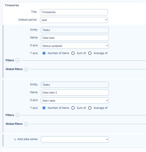
Step 3: Add a Data Series
For each data series:
- Choose the Entity (e.g., Tasks, CRM cases, Projects)
- The entity must contain a date attribute (like due date, contract date, created on, etc.)
- Select which date field will be used to position data points over time
- Choose the value to display:
- Count of items
- Sum or average of a numeric attribute (e.g., story points, revenue, hours)
Example: Show sum of story points from closed tasks using their due date
Step 4: Apply Filters
- Use filters to define which records are included in the data series
- This allows you to focus on specific conditions (e.g., only closed tasks, tickets from a certain category, or billable hours)
Step 5: Repeat for More Data Series
- Add additional series to compare multiple data types in one chart
- Example: Total story points, income, and billable hours all shown together over time
Step 6: Save and View
- Click Save page and go back
- The Time Series chart now appears on your dashboard, combining all configured data series into one timeline view
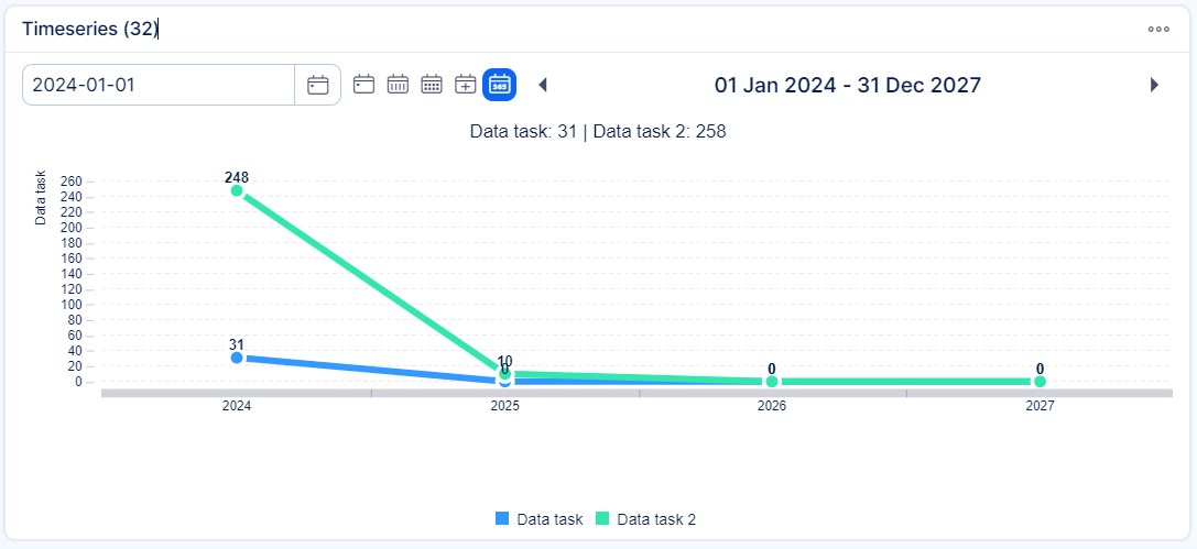
Conclusion
Time Series charts in Easy8 offer a powerful way to visualize changes and performance across different entities and time periods. With flexible filters and multiple series, they help you build dynamic, data-rich dashboards.