Introduction
This guide explains how to use the Line Chart widget in Easy8 dashboards. Line charts are great for visualizing trends over time. They show data points connected by straight lines, helping you understand how values change across a time period or other ordered values.
Target Audience
- User
Prerequisites
- Access to a dashboard
- Permission to customize the dashboard and add widgets
- Data available for the selected entity (e.g., tasks, users, CRM)
How to Use Line Charts on Dashboards
Step 1: Add the Line Chart Widget
- Open your dashboard
- Click Customise
- Use the Select widget from list panel and select the Line Chart widget
Step 2: Select Entity and Name the Chart
- Choose the Entity (e.g., Tasks, Projects, Users, CRM)
- Enter a clear Name for the chart
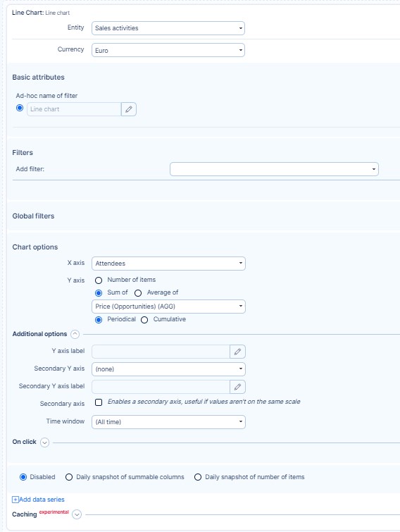
Step 3: Apply Filters (Optional)
- Use Filters to limit the data (e.g., Assignee is me, Status is Open)
- Global filters from the dashboard settings will also apply
Step 4: Configure the Axes
- Set the X-axis (e.g., time intervals, user names, project titles)
- Set the Y-axis (e.g., count of tasks, sum of spent time)
- Optionally, add a second Y-axis to show two different metrics
- Choose whether to use a shared Y-axis or separate axes
Step 5: Adjust Chart Options
- Define labels, time window, data order, or limit
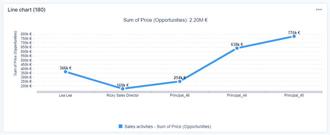
- Data points are connected by lines in the order of the X-axis
- If values are missing in a series, they are shown as 0 to keep the lines continuous
Step 6: Caching and Interactivity
- Select a caching period (in days) to reduce loading time, or leave empty for default (1 day)
- Use the On click setting (available in Business Dashboards) to define actions on click
Step 7: Save and View
Click Save. The line chart will now display on your dashboard with the selected data and settings.
Conclusion
Line charts in Easy8 are a clear and effective way to track data trends over time. With flexible settings for filters, axes, and appearance, you can build a powerful visual overview tailored to your needs.