Introduction
This guide shows you how to use the Generic Gauge widget on Easy8 dashboards. A generic gauge displays a needle on a dial to represent a selected value. It is especially useful on executive dashboards to track key business indicators. You can configure up to three tags in one widget to switch between different data views quickly.
Target Audience
- User
Prerequisites
- Access to a dashboard
- Permission to customize the dashboard and add widgets
- Tracked data related to tasks, time, budgets, or other entities
How to Use Generic Gauges on Dashboards
Step 1: Add the Generic Gauge Widget
- Open your dashboard
- Click Customise
- Use the Select widget from list panel and select Generic Gauge
Step 2: Configure Widget Name and Tags
- Name – Enter a clear name for the widget
- Tags – You can set up to 3 tags (e.g., Weekly, Monthly, Quarterly). Tags work like tabs and allow you to switch between different views within the same widget
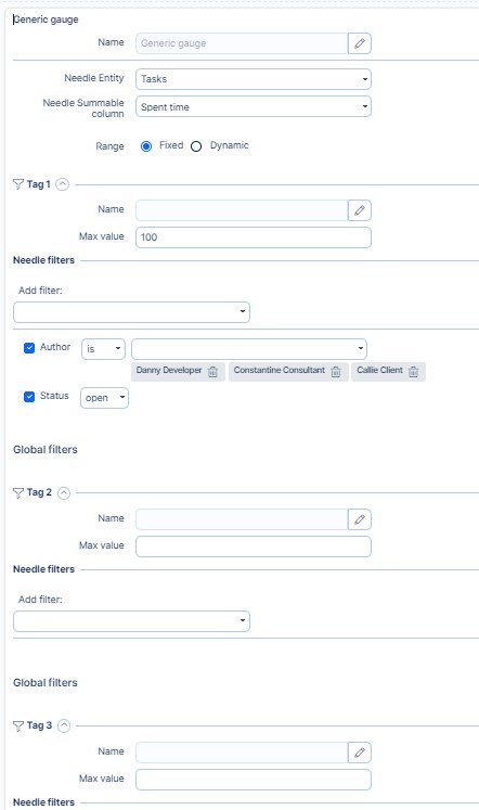
Step 3: Set Needle Data for Each Tag
For each tag, configure:
- Needle entity – Choose the data source (e.g., tasks, CRM cases, spent time)
- Needle summable column – Select the numeric value to display (e.g., spent time, remaining time, price)
- Needle filters – Set filters to define which records should be included in the needle value
Example: Tasks with status = Open and priority = High
Step 4: Define the Range (Gauge Scale)
You can set the range in two ways:
- Fixed – Enter a manual maximum value (e.g., 100 hours)
- Dynamic – Use another entity and summable column to determine the maximum value (e.g., sum of estimated time on open tasks)
This allows the gauge to auto-adjust based on live data.
Step 5: Set Range Filters (Optional per Tag)
Apply filters to the range entity, just like you do for the needle. This ensures the dynamic range reflects only relevant records.
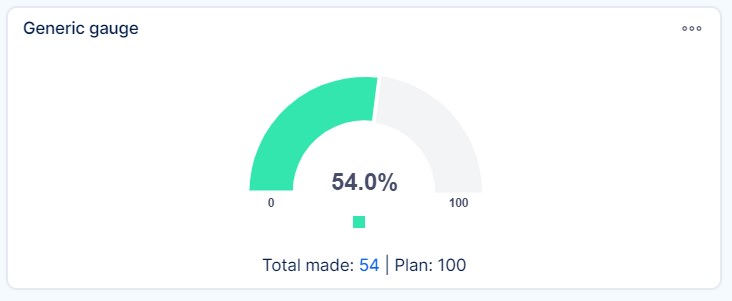
Step 6: Save and Use the Gauge
- Click Save
- On the dashboard, use the clickable tags to switch between data views
- The needle will update based on the filters and settings applied per tag
Conclusion
The Generic Gauge widget is a flexible and visual way to track performance indicators on Easy8 dashboards. With support for multiple tags, fixed or dynamic ranges, and a variety of data sources, it offers powerful insights in a compact, interactive form.