Introduction
This guide explains how to use Bar Chart widgets on Easy8 dashboards. Bar charts are helpful for visualizing grouped data such as task status, project workload, or budget comparisons. They present values as vertical bars, which makes trends and differences easy to see at a glance.
Target Audience
- User
- Administrator
Prerequisites
- Access to a dashboard
- Permission to add or customize widgets
- Relevant data already tracked in the system (e.g. tasks, projects, budgets)
How to Use Bar Charts on Dashboards
Step 1: Add the Bar Chart Widget
- Go to your dashboard
- Click Customise
- Use the Select widget dropdown at the top to find and insert the Bar Chart widget
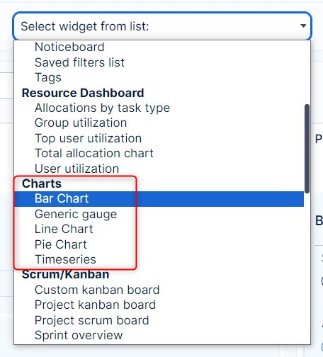
Step 2: Select Data Source
- Choose the entity type (e.g., tasks, users, projects, budgets)
- This defines what kind of records the chart will display
Step 3: Configure X and Y Axes
- X-axis: Select the grouping attribute (e.g., status, user, project)
- Y-axis: Choose the numeric value to display (e.g., count of tasks, sum of estimated hours, total budget)
Example: Show the number of tasks grouped by status
Step 4: Apply Filters
- Add filters to narrow down the data set (e.g., only open tasks, tasks from a specific project)
- This helps focus the chart on relevant information
Step 5: Set Display Options
- Choose if you want to display absolute values or percentages
- Customize chart colors if needed (optional)
- Add a title or description for clarity
Step 6: Save and View
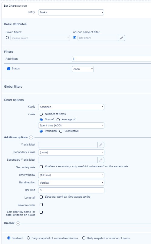
Click Save to apply the widget to your dashboard
The bar chart now displays your configured data in visual form
Conclusion
Bar charts are powerful visual tools in Easy8 dashboards. They help you understand grouped data quickly and clearly, improving your ability to make informed decisions based on real-time metrics.